
The impact of colour temperatures and relationships on the feeling of a painting
One of the areas of learning that I’ve been delving deep into this year is colour theory.
A quick primer: Colours all have a temperature – a tendency towards warmth or coolness. On a basic level, we normally think of blues and greens as cool colours and reds, yellows, and oranges as warm colours. But also, there are warm blues and cool blues, and there are warm reds and cool reds. Each colour has warm and cool variants. Also, a painting might have a generally warm colour palette or a generally cool one, or a mix of both.
This little tulip painting taught me so much about colour
This painting below has a warm palette. Even though it’s got quite a bit of green, it’s a warm sage green. The purples are quite warm too.Can you see how the warm temperature of the colours gives it a lovely warm glow?
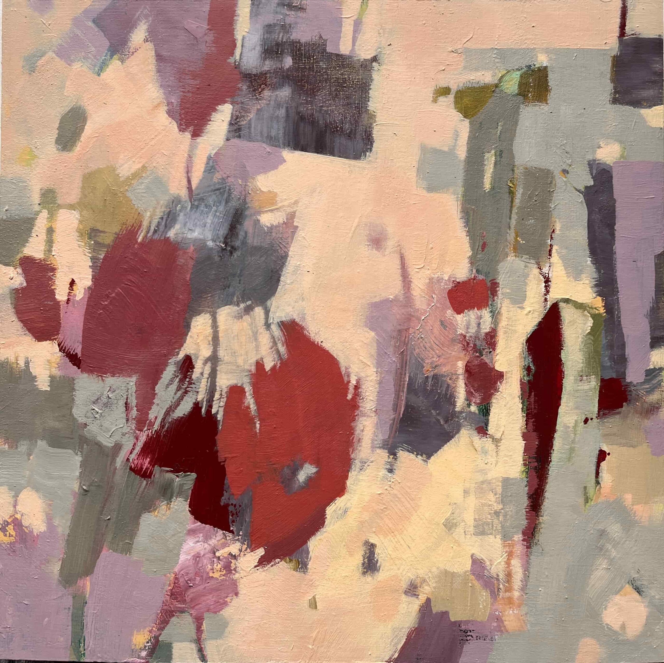
I loved the warm glow, but I felt like it was perhaps a bit dark, so I brought in a very light sage green. It was a harmonised green, created with the same Zorn palette, and yet because of how much white it had in it, it was quite a cool green compared to the rest of the painting. See how much it changed the overall temperature of the painting? Now it no longer feels like a clearly warm painting. It’s got both warm and cool areas to it, which feels less peaceful.
What I also realised is that, adding that much green made it into a painting that was predominantly red and green, and had the same amount of green as the red. And since red and green are complimentary colours, they have a powerful relationship that makes us want to look at them, and having them in equal proportions means that neither of them gets to shine.
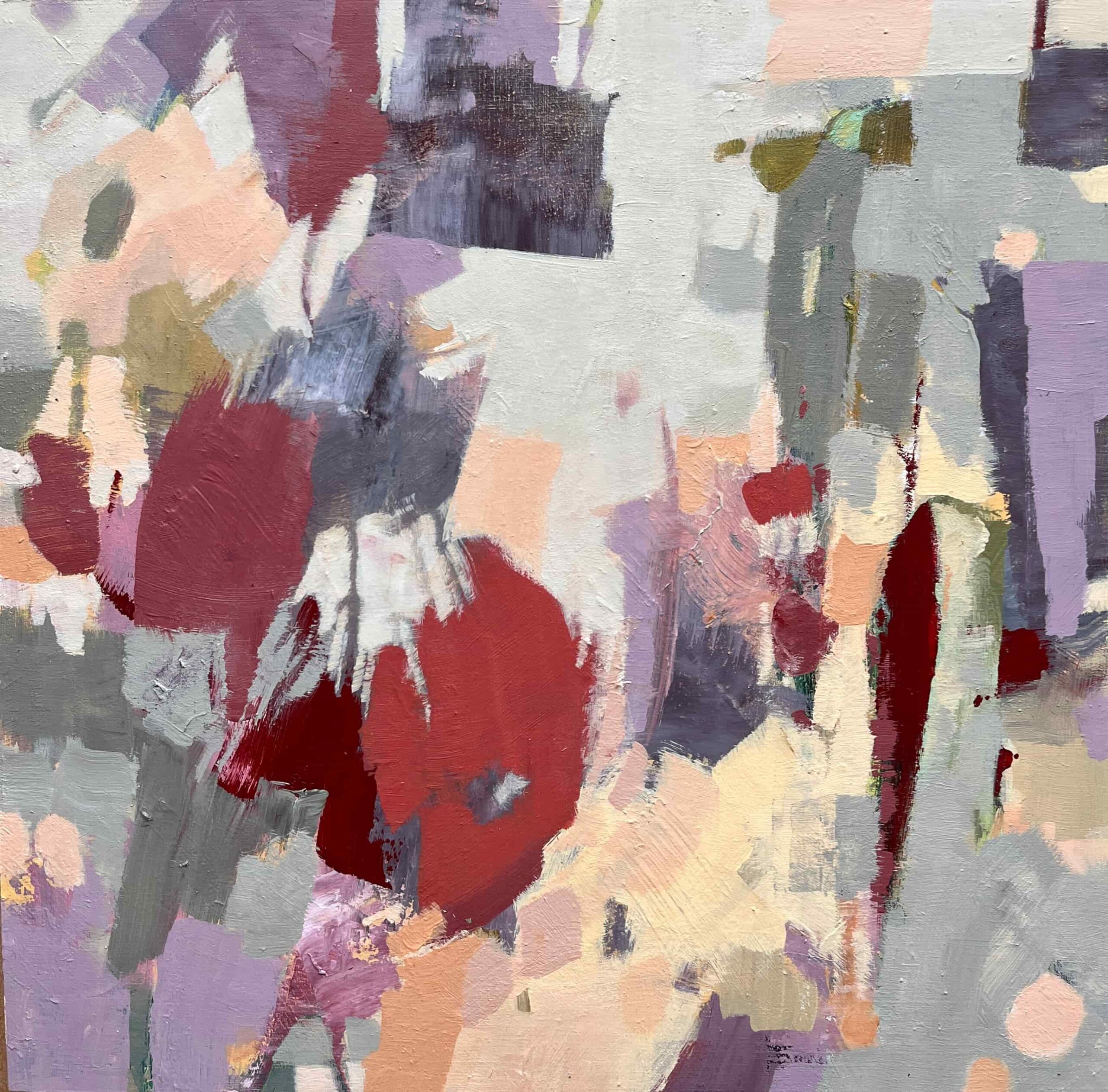
So I painted over with a very light peach. This feels more peaceful to me again. The warmth has returned. It’s less busy without the light green shapes. The red and green are no longer fighting for the light, and it’s clear that the reds are the star of the show, with the greens playing a support role that only makes the reds look even better.
Can you see it? Can you feel it?
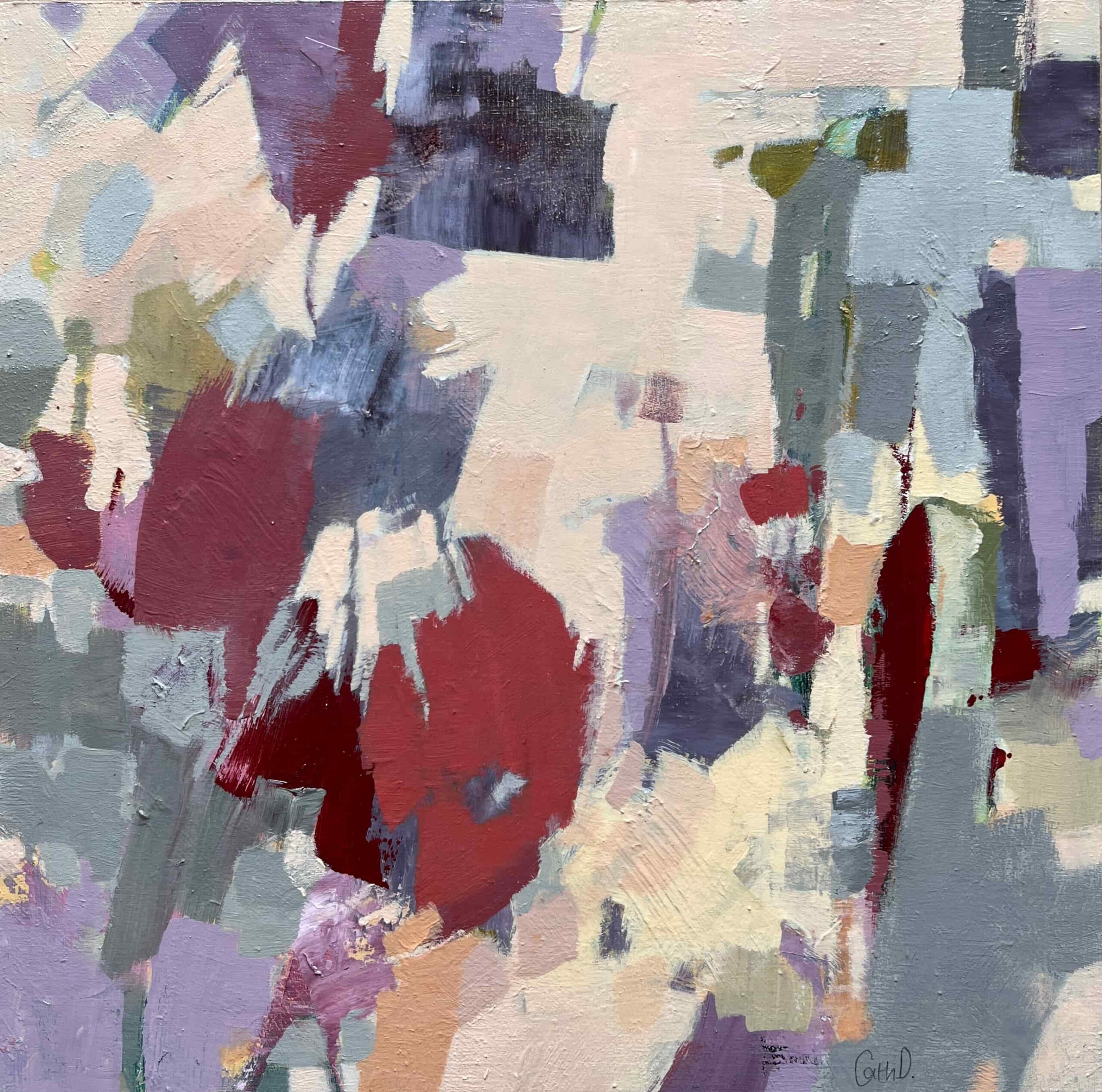
Which version do you like best?
I do wonder about a 4th option… what if I went with a darker, pinker peach background colour? Like the first version, but richer, redder, warmer? It would reduce the value contrasts which, in theory would emphasise the colour qualities and differences, but I’m wondering if it would make the painting feel too dark overall? Should I do it?