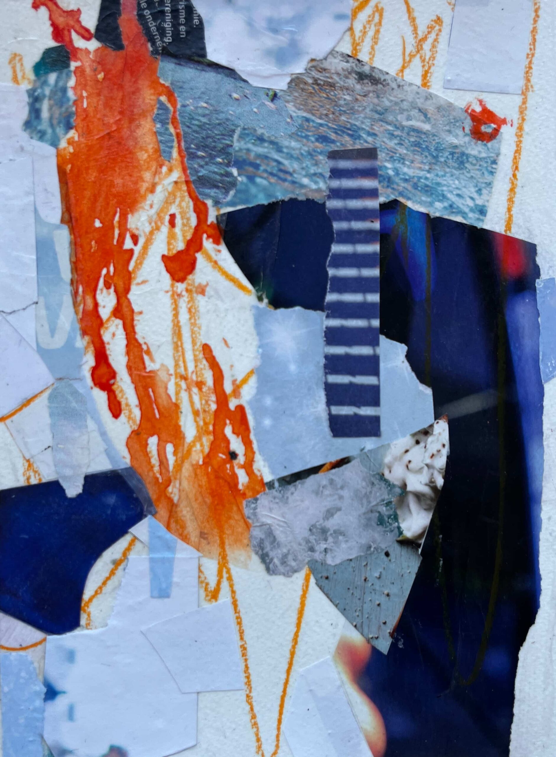
Abstract Magazine Paper Collages in Cool blues and Zesty oranges
I’ve been feeling drawn to play with an old love of mine again… magazine collage art. In the past, my magazine collage art has been representational art of landscapes, skies, and botanical subjects. This time I wanted to explore working in this medium to create completely abstract compositions.
I’ve also been immersing myself in a lot of learning and practice on the topic of colour theory, so I chose a limited colour palette of complimentary colours… blues and oranges.

As I worked, instead of thinking about representing a subject or even a feeling, I worked without a plan. As I worked, I was thinking about design elements and choosing papers based on colour differences, especially differences in saturation, value, and temperature.
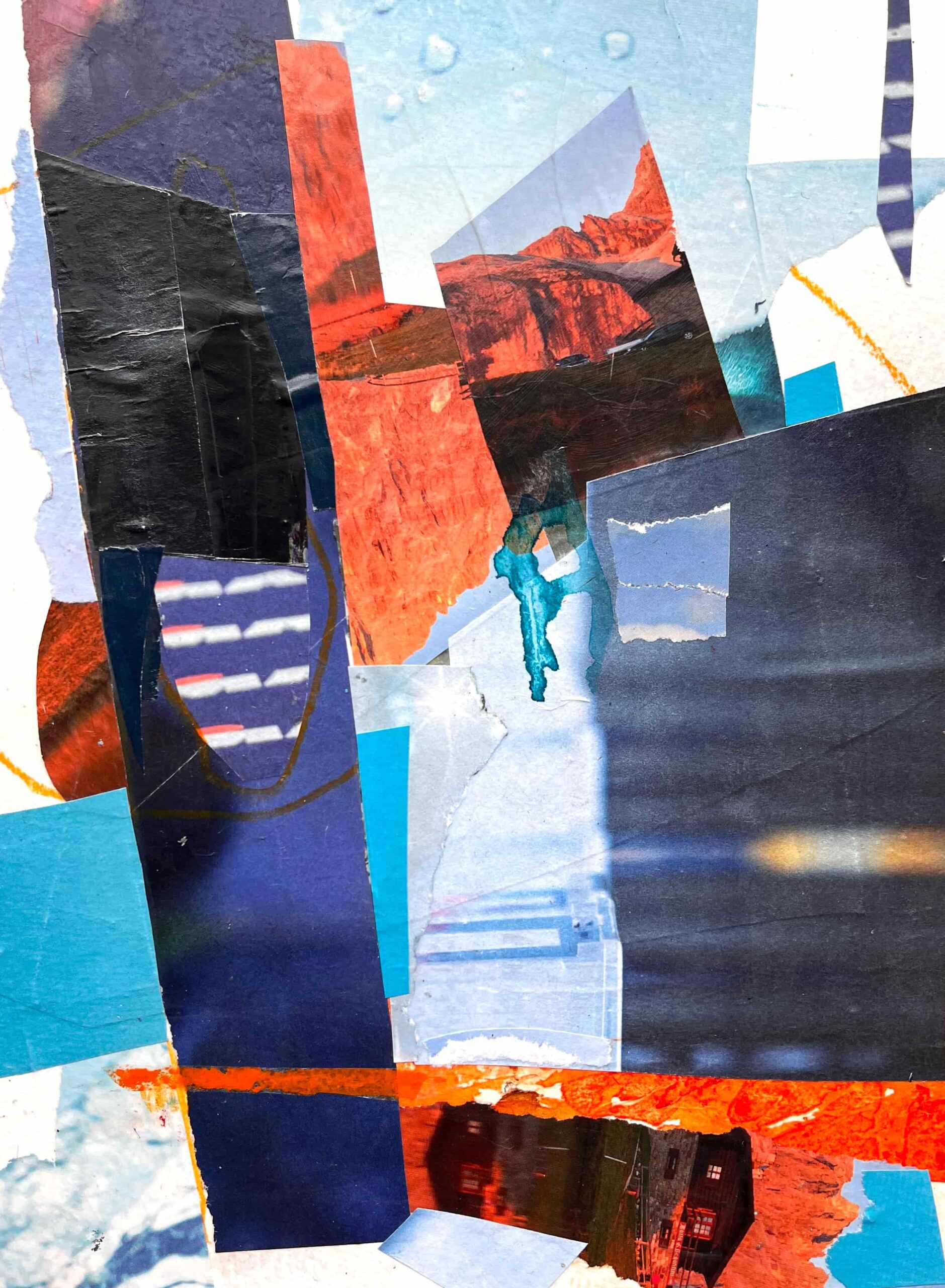
You’ll see that I used some hand-made tissue paper and an orange crayon,,,a small departure from my traditional magazine paper collages (a departure I thoroughly enjoyed!). Now I’m feeling drawn to experiment with combining magazine papers with paint and drawing materials.

I had a lot of fun with this and I love how these 4 turned out. The last steps are to title them and choose frames for them, to give them a hanging system, protection, and that lovely feeling of completeness.
What would you title them? And which frame would you choose?